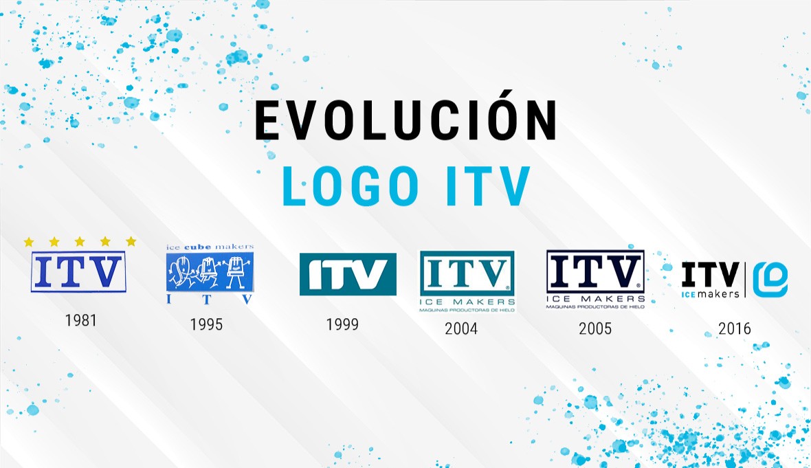
The visual identity of ITV Ice Makers has spanned more than four decades of transformation, growth, and international projection. Each of our logos has reflected a specific stage in our history: from the poetic inspiration of our beginnings to the technological, efficient, and global image that represents us today.
In its early days, the logo was born with an aspirational slogan, “The ice of the stars,” positioning the brand as a symbol of quality. In the mid-1990s, an iconic graphic element was introduced for the first time: the drop transforming into an ice cube, directly representing our product and process.
Over time, the design became more stylized and artistic, reflecting a commitment to aesthetics and innovation. Elements of the original typography were recovered, technical descriptors were added, and different color palettes were explored, strengthening the brand’s technical and professional identity.
In 2010, the concept “Ice for Life” was introduced—a message that marked a turning point in ITV Ice Makers’ identity. More than a slogan, it became a statement of purpose: ice as an essential element of life. Finally, in 2015, our current logo was born: a dynamic drop over a renewed corporate blue. Today, this image clearly conveys who we are—a brand driven by design, efficiency, and innovation.
You can explore the journey of ITV’s image at the following link:

